welcome I portfolio I about I hosting I contact I customer login I why?     

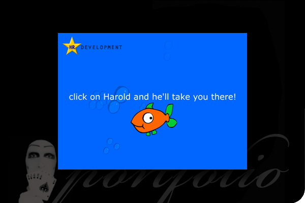
Fishy goings on down in the Human Resources department!

Meet Harold, he was the 'device' the HR Department had chosen to communicate new features on the company intranet, this time he did his job far to well, everyone loved him and all clicked at once, unfortunately to many people trying the same thing at the same time caused the intranet to go down!

To see Harold in action, click the thumbnail below.

To see the animation you will need the Adobe Flash plug- in, you can download it here.

examples of other work: [1] [2] [3] [4]

'Spot the difference', 'reality' isn't always the way it appears.

The map and compass are from separate images, we took the compass from the map it was originally on and 're-touched' it onto the new 'old' map, the image was then printed onto NE Flute, a lightweight packaging board from Abbey Board to use as a sample to show the benefits of this versatile card.

To see a larger image of the sample, as well as the original photograph, click the images below.


examples of other work: [1] [2] [3] [4]


A visual explanation of a noisy installation!

A series of A1 sized display boards for Aldeburgh Music to go with the 'sound reactive light installation' on display at Snape Matlings.

For larger images of the posters click the thumbnails below.

examples of other work: [1] [2] [3] [4]


Distinctive logos for a diverse range of clients, this is what people should remember.

These are some of the logos we have designed for building companies, shipbuilders, awards, cupcakes, new property developments and even a doctor who 'heals' documents.

For larger images, click the thumbnails below.

examples of other work: [1] [2] [3] [4]

A corporate look for the Music Master' and Mistresses' Association.

Over a number of years varous publications had been established, with a diverse range of design styles, from A4 magazines, Welcome Folder and Yearbook to the A5 Annual Music Awards Directory, each with it's own style and feel.

This was an atempt to unify all the various publications into a distinctive and recognisable style, each sepserate but belonging to the same 'family' source.

For larger images, click the thumbnails below.

examples of other work: [1] [2] [3] [4] [5] [6]


If your in need of some retail space in ipswich, where better than one of the new dockside developments?...

A small A5 leaflet to high-light new retail opportunities on one of Ipswich waterfronts new developments, with the emphasis on 'lifestyle' rather than details.

For larger images, click the thumbnails below.

examples of other work: [1] [2] [3] [4] [5] [6]